A calmer welcome
A player wrote in about the join screen: “It is super overwhelming to load in and immediately be displayed with 5 different options, all with different stats, which I don't have much context for yet.” They were right. The lobby now leads with your callsign and one big gold button, shows one machine at a time, and puts everything else behind quiet doors. Land in, name yourself, take off.
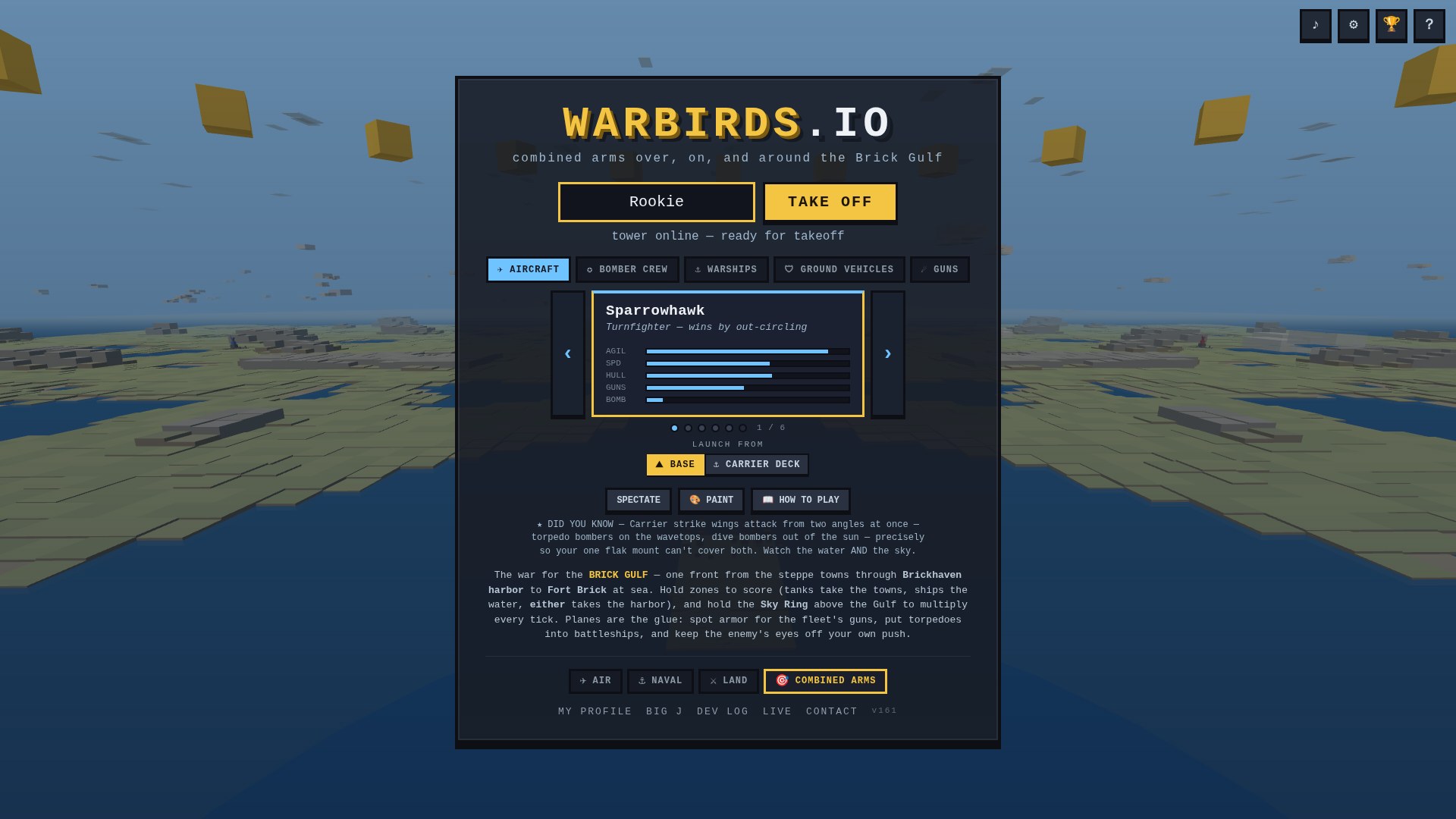
A wall at the front door
The old front door hit a brand-new pilot with everything at once: six machines side by side, each bristling with stat bars nobody had explained yet, and the TAKE OFF button parked way down the page below two rows of hardware it wanted you to evaluate first. The combined-arms lobby was the same wall with more tabs — five arms of the service all shouting for a rookie's first click.
The kicker: every option on that wall matters to somebody. Veterans want the deck choice, the paint shop, the spawn heading rose, the keybind editor. The problem was never the features — it was that the screen treated all of them as equally urgent, when the only urgent thing on a first visit is fly something, now.
One card in the spotlight
The unit picker is now a carousel. One stat card in the spotlight, ‹ and › to walk the hangar, a dot rail with a “1 / 6” so you know how deep it goes. What you see is what you spawn: arrowing onto a card picks it, and a career-locked hull can still be admired — the lock badge says what it costs, and your actual pick stays put. The category tabs survive, but as color-coded chips: sky blue for aircraft, teal for the fleet, olive for armor, orange for the guns — the accent runs through the active tab, the card's roofline, and its stat bars, so “where am I spawning” reads at a glance.
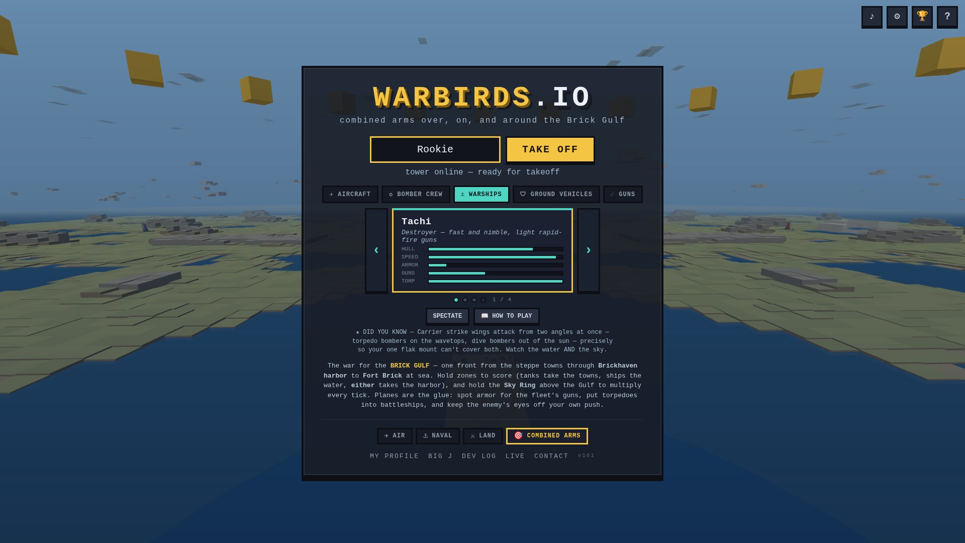
Quiet doors for everything else
TRAINING and SPECTATE used to stand shoulder-to-shoulder with TAKE OFF, dressed almost identically. They've stepped back into a small row below the hangar, joined by two new folding doors: 🎨 PAINT (the swatch row now unfolds on demand instead of always sitting under the cards) and 📖 HOW TO PLAY (the whole controls manual, folded to one line until you ask). The site chrome — soundtrack, settings, hall of fame, about — became four icon buttons pinned to the top-right corner, exactly as the feedback suggested. The ♪ even lights gold while the soundtrack plays.
The result: one machine in front of you when you arrive, its handful of stats, and the whole thing fits on one screen — TAKE OFF is the second thing you see after the masthead, not the last. Nothing was taken away from the veterans; every feature is still one click behind a door. The rookie just isn't asked to read the whole toolshed before touching the sky.
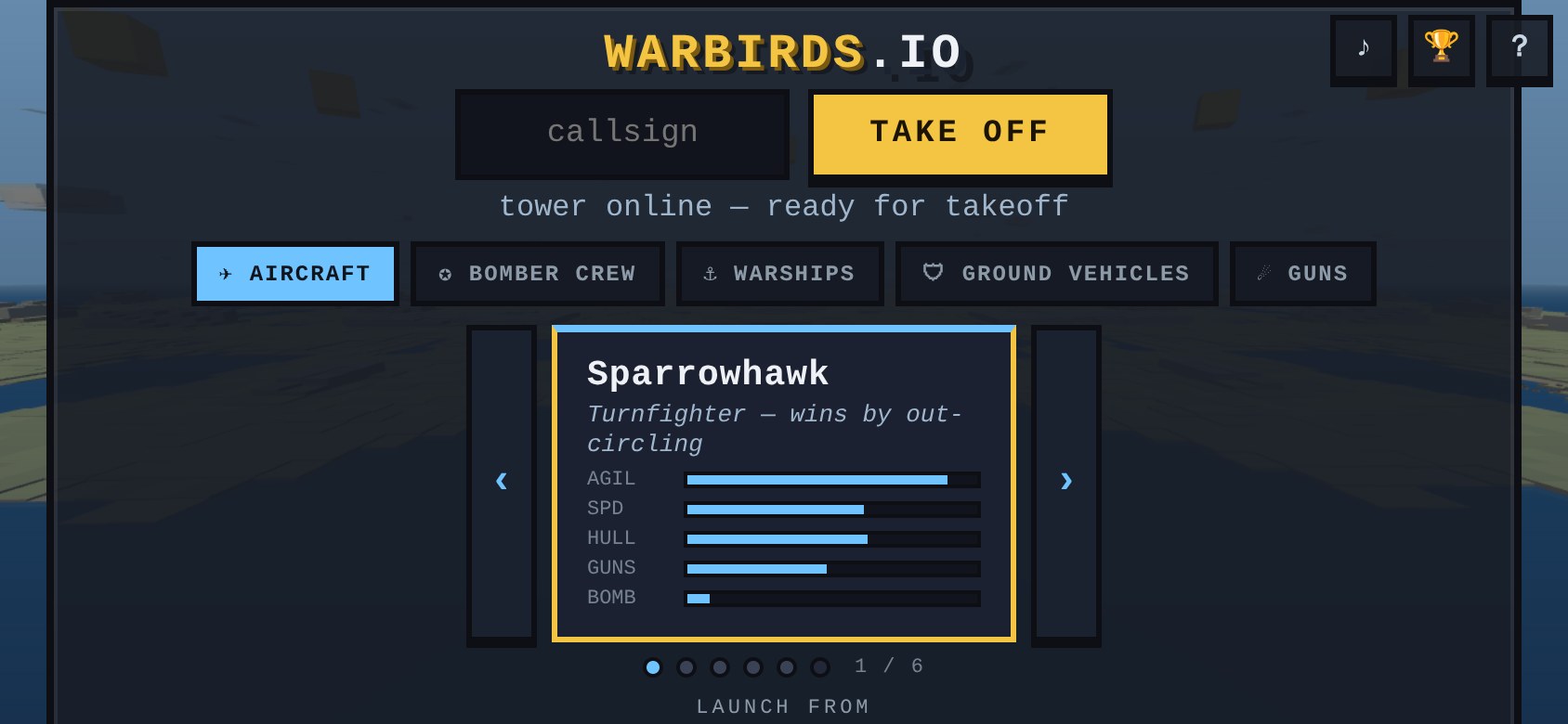
Everything is still there
Nothing got cut. The soundtrack, settings, the hall of fame, the about page — all still there, now as four tidy icon buttons pinned to the corner instead of a row of links fighting the play button for attention. Paint your machine, rebind your keys, read the manual, drop into training or spectate a round: every one of those is a click away, the moment you go looking for it. It just waits until you do.
The war is still overwhelming. The front door isn't.